The first screen doesn't answer
Visitors decide within seconds whether to keep reading. If the first screen doesn't show what you do and who it is for, they leave without scrolling.
You built the website, maybe even ran ads, and the inquiries stay quiet. The tempting move is to push more traffic, but pouring visitors onto a leaking structure does not change the result. This post covers where visits break off before becoming inquiries, and the order to fix those points in.
If your website gets visits but no inquiries, the flow is usually breaking at one of three points: the first screen's message, the evidence customers need to decide, or the inquiry path itself. Identify the breaking point first, then fix from there.
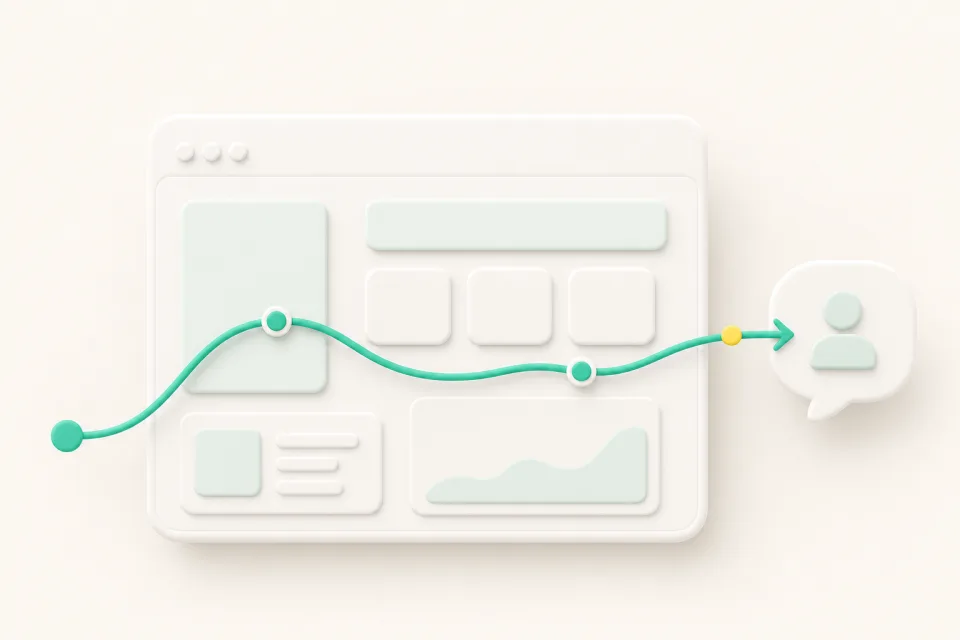
Visitors decide within seconds whether to keep reading. If the first screen doesn't show what you do and who it is for, they leave without scrolling.
Before inquiring, customers want to check pricing criteria, service scope, and how the process works. Without that, they postpone the decision, compare elsewhere, and don't come back.
A lone phone number or a long form with many fields raises the threshold. Visitors who arrive outside business hours have no way to ask and leave without a trace.
When visitors arrive from search and the page doesn't match what they were looking for, visit counts pile up and nothing converts. The search query and the question the page answers have to match.
Put who the service is for, what makes it different, and what to do next on the first screen. Give visitors the material to start deciding right away.
Organize pricing criteria, the process, and frequently asked questions so they can be checked before inquiring. Visitors whose questions are already answered are the ones who move on to inquire.
Design every page so the next step toward a consultation stays visible. Shorten the distance between the moment of interest and the inquiry button.
Set criteria for answering repeated questions up front and passing consultation signals to a staff member. Visitors outside business hours can still reach the next step.
If two or more items fail, fix the path before buying more traffic. That said, fixing the path does not guarantee more inquiries. The safe approach is to identify where the flow breaks and reorganize the structure in order.
Check the path first. If the structure doesn't turn visits into inquiries, more traffic only raises costs. The safe order is to fix the first-screen message, decision evidence, and inquiry method, then grow traffic.
An invisible button is only occasionally the problem. Most visitors stop before the button — the evidence to decide is missing, or the inquiry method feels burdensome. Review the flow leading to the button before its size.
Phone works well for customers who prefer it, but you lose those who find calls burdensome and anyone visiting outside business hours. Adding a low-threshold channel for leaving a simple question lets those visitors reach the next step.
Adding a chatbot by itself guarantees nothing. Its role is to lower the threshold by answering repeated questions first, and to pass consultation signals on for staff review. It works when you also design the criteria for when automated answers stop and a staff member takes over.
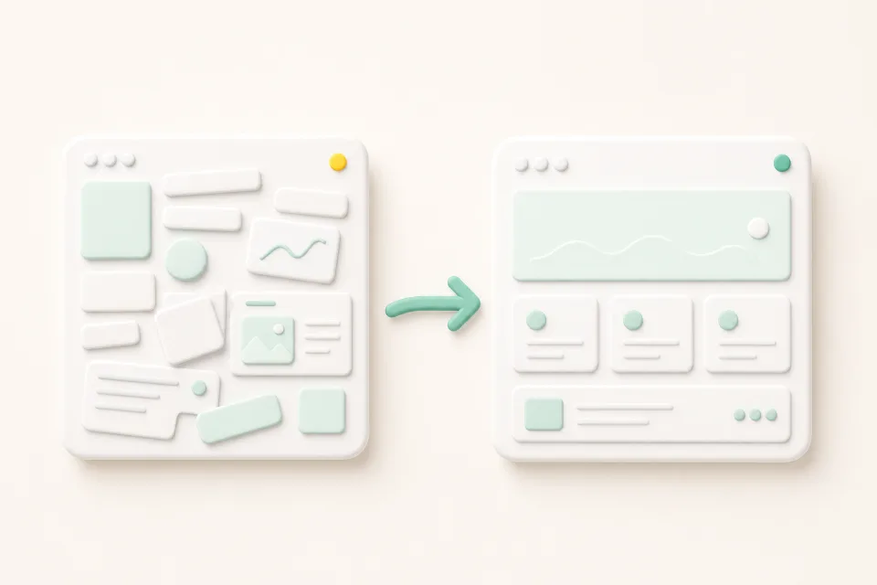
A website redesign is not a visual refresh — it reorganizes structure, content, and inquiry paths around today's customer journey. Here are the signs it is time, and the order to start in.
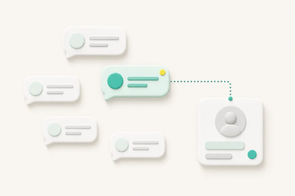
Most inquiries are repeated questions about hours, location, and booking. Here is why a chatbot should handle the repetition and route judgment calls to your staff.