Reading it doesn't reveal what you do
An abstract slogan like "We create new value" fits any company. If a visitor reads your first sentence and still can't guess your industry or service, the screen hasn't explained anything yet.
The screen that appears the moment your website loads is what the industry calls the hero section. Most visitors decide from this screen alone whether to keep reading or leave — yet many websites fill it with nothing but a clever slogan and a large image. This post covers why visitors leave at the first screen and what belongs there instead.
The first screen of a website (the hero section) must answer four things without scrolling: what you do, who it is for, why you can be trusted, and what to do next. A screen that answers the visitor's questions converts better than one with a clever tagline.
An abstract slogan like "We create new value" fits any company. If a visitor reads your first sentence and still can't guess your industry or service, the screen hasn't explained anything yet.
The first thing visitors check is "does this place handle my problem?" When the target customer and their situation aren't visible on screen, even a perfect-fit customer concludes it's not for them and leaves.
A layout where a huge photo or video fills the screen with faint text laid over it conveys mood, not decision material. Images should support the message — they can't replace the explanation.
Even an interested visitor stalls when there's nothing that says what to do next. No button — or only a vague one like "Learn more" that doesn't say where it leads — means interest never becomes action.
Make the largest text on screen a concrete sentence that reveals your industry, service, and how you deliver it. Ideally it echoes the words visitors typed into search. Instantly understood beats cleverly worded.
Put the target customer and their situation into the headline or supporting line. Speaking to everyone reaches no one. The narrower the audience you name, the more precisely it lands with the customer who matches.
Place one piece of evidence that can be verified as fact — years in operation, cumulative cases, a qualification or certification. One checkable fact builds more first-impression trust than a stack of adjectives.
Add one button with a clear next step, such as booking a consultation or requesting a quote. Multiple buttons make choosing harder, so pick one primary action and keep a lower-key secondary path for visitors who aren't ready yet.
If two or more items fail, start by fixing the first screen. That said, fixing it does not guarantee more visits or inquiries. The first screen is where judgment begins — it only turns into results when comparison-stage information and the inquiry path continue from it.
The slogan itself isn't the problem — but if it alone doesn't convey what you do, it hasn't earned the biggest spot on the screen. The safe arrangement is to make an explanatory sentence the lead and move the slogan to a supporting position.
No. The first screen's job is to give visitors material to decide whether to keep reading, not to deliver everything. Once it answers what you do, who it's for, why you're credible, and what to do next, the rest belongs in the sections below.
Yes. But the image should support the message — if it obscures the text or slows loading noticeably, it costs more than it adds. On mobile especially, check that the image doesn't push the headline and button out of view.
One primary action button is the recommended baseline. Pick the action most tied to your business goal, such as booking a consultation, and visually tone down a secondary link for visitors still in the comparison stage — it makes choosing easier.

If you get visits but no inquiries, the flow usually breaks at the first screen's message, the decision evidence, or the inquiry path. Here is how to find where it breaks and the order to fix it in.
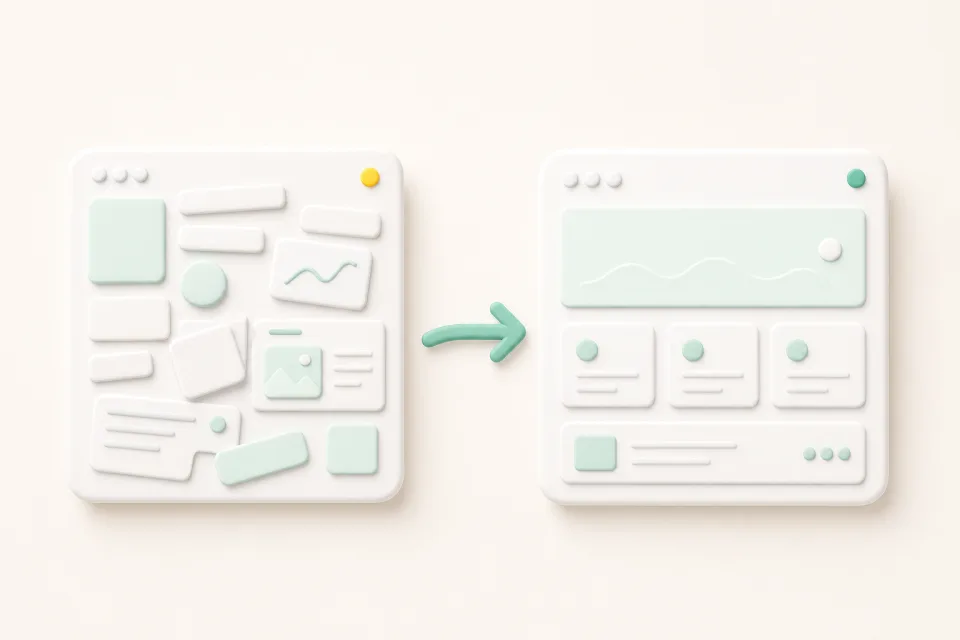
A website redesign is not a visual refresh — it reorganizes structure, content, and inquiry paths around today's customer journey. Here are the signs it is time, and the order to start in.